
Oppo ColorOS 11 review: Small on features, big on customisation- Technology News, Firstpost
Sheldon PintoDec 24, 2020 16:08:40 IST
Oppo has come a long way indeed! From being called an iOS lookalike, it’s Android-based ColorOS user interface had taken a drastically different route, especially after the launch of version 7.
ColorOS 7 was a big jump from previous versions of Oppo’s mobile operating system and cemented its place as a serious player in the smartphone segment. In India, Oppo also implemented a couple of India-specific features such as “Smart Riding”, “Riding Mode” and integrating the government’s DigiLocker service into their own DocVault.
ColorOS 7 also introduced a brand new look, went with new icons, live wallpapers, and delved into UI customisation instead of simply offering themes. Even though the level of customisation was a bit limited, it was interesting to be able to customise the overall look of an icon without the need to resort to a third-party launcher. The OS was also focused on making the operating system lightweight. This involved performance optimisations that made the OS run buttery-smooth not just on premium devices, but on mid-range hardware such as the Reno 4 Pro as well. In short, ColorOS went from being just another Android skin by a Chinese smartphone brand to something serious and mature, like Samsung’s One UI or OnePlus’ OxygenOS.
ColorOS 7 also introduced a brand new look, went with new icons, live wallpapers, and delved into UI customisation instead of simply offering themes. Image: Tech2/Sheldon Pinto
The next version happens to be called ColorOS 11. Oppo appears to have skipped 3 versions, even though it is the next immediate milestone update. The name has more to do with matching Google’s Android 11 mobile operating system than anything else.
ColorOS 11 may sound like a big leap and it is, in more ways than one. But it’s not as big as ColorOS 7 was to everything that came before it.
One detail to note is that I played around with beta software that was released much later than most of the reviews that are available online. Features like Flex Drop that were not available in the early betas and have now made their way to the latest versions. Version CPH2023_11_C.57 that I ended up reviewing on an Oppo Find X2, was released on the 30th of November 2020.
It’s big on customisation
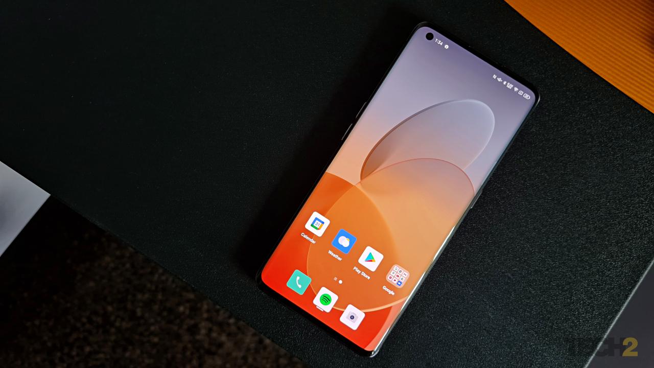
One detail that most Oppo fans and users will appreciate is that the OS has not changed too much visually. This is in stark contrast compared to OnePlus’s OxygenOS 11, that goes from an almost-stock state to something that now looks similar to Samsung’s One UI. Changes like these are not usually welcome, especially when there are so many fans (and a cult following) involved.
Most of the changes you will see in this review (and when you receive the final builds on your Oppo device) are more add-ons to the existing setting than changing the way you use the OS on a day-to-day basis. This also makes it easy to ignore something you don’t want, because it does not get in your way. And one such add-on is how you access certain customisation features.
Quick access to customisation
Need to change a wallpaper? Just long-press on a blank space on the home screen and you get a pop-up from the bottom instead of going through a menu that eventually takes you to wallpapers, after which you will eventually select and change your wallpaper.

I did not have to leave my home screen to change the wallpaper, and it all happened in the bottom half of my display that’s accessible using just my thumb.
>Long press on the home screen
>Choose between Wallpapers, Icons, Layout
>Select which type of wallpaper you want (Static, Live, More from the theme store)
>Select the wallpaper
>And it’s applied!
As you can see from the screenshots, I did not have to leave my home screen to change the wallpaper, and it all happened in the bottom half of my display that’s accessible using just my thumb. It’s all about what you want to access, right there in front of you. No extra steps and no additional menus, which makes it all quite sensible, even compared to stock Android.
Customisable icons
Oppo is the only smartphone brand to offer such a level of customisation when it comes to icons. Image: Tech2/Sheldon Pinto
While the selection of wallpapers and icons remains the same, there’s a lot of fine-tuning now available in terms of customisation. While you could already change the shape of an icon by choosing presets with a size and layout (circle, square, etc.) of your choice, you can now even adjust the size of the app name (or label), for those who prefer it to be bigger or smaller than the overall system font. For those not in the know, Oppo is the only smartphone brand to offer such a level of customisation when it comes to icons.
A new ‘Personalisations’ section
While quick selections to tweak the home screen are available at the home screen, you will have to jump into the ‘Settings’ app to change the others. All these visual modifications are now neatly tucked into a section called ‘Personalisations’. This is similar to OxygenOS 11’s ‘Customisation’ section, just that ColorOS displays all the options up front, instead of hiding everything under separate menus.
Here, you can change everything you possibly can in terms of the visuals, whether that’s setting a new theme, wallpapers, always-on display (AOD), icon style, app layout, fingerprint styles, system colours, font & display size, notification drawer icons and even the edge lightning (where available). And there are plenty of additions as well.
A new addition is the “Colour Scheme” that lets you choose between a preset palette or choose a single colour of your choice. Image: Tech2/Sheldon Pinto
The AOD isn’t limited to the available presets (like on MIUI and One UI); you can literally draw your own! I tried my hand at it and much like every other option, it is infinitely customisable.
A new addition is the “Colour Scheme” that lets you choose between a preset palette (to go with your wallpaper) or choose a single colour of your choice. This is similar to the themes/accents that OxygenOS offers.
The fonts sub-section is where you kind of get the idea about how serious Oppo is about customisation. You finally get more than one font to choose from: Roboto (Android default) and Oppo Sans. Oppo Sans is what Oppo calls an ‘adaptive’ font. This type of font lets you customise its weight (making it bolder or finer) and even gets its own ‘auto-adapt’ feature that when activated, will adjust the font weight automatically depending on the scenario.
A customisable Dark mode?
You can now select varying levels of black for your dark mode by tapping on any of the three presets.
Yes. Dark mode is also surprisingly customisable. It’s available under “Display & brightness” and you have to switch to Dark mode to access the options.
Apart from applying it to apps that don’t support the feature (ever wondered what Amazon looks like in Dark mode?) users can also select the intensity of the dark mode under ‘Styles’. Yes! You can now select varying levels of black for your dark mode by tapping on any of the three presets (enhanced, medium, gentle). These basically go from a deep black to a dark grey. While some may find the feature pointless, it’s there so that text that sits over the deep blacks (especially on AMOLED displays) does not look too harsh when you are reading in the dark.
Like all add-ons, you can jump in and enjoy customising your software experience after updating to ColorOS 11, or just ignore them if you are not into that stuff.
And sadly, this is the only bit about ColorOS that I enjoyed, as the rest of the features go from “meh” to unnecessary here on.
Playing catch-up with features
With a jump from ColorOS 7 to ColorOS 11, many will expect massive improvements in terms of features, but that’s really not the case.
Android 11 with a few things missing
This is the release candidate of Oppo’s ColorOS 11 software, but the version I have with me is quite close to the final build as opposed to the early beta version I had tested months ago. With that said, you really don’t feel Android 11 jutting out in places, like I witnessed in Vivo’s Funtouch OS on the V20 Pro (review). And that’s a good thing, because it reveals the usual Android 11 features like the new notifications system in a subtle way, a path any skinned OS should take.
But Oppo’s deep customisations also mean that features like the new “Power Button Menu” that provides shortcuts to payments and devices in your connected home, have been omitted entirely (for reasons best known to Oppo). The same goes for the rather useful Media Player controls of Android 11 that makes it easy to switch the music from your earphones to your Google Home right from your notifications drawer.
Oppo Relax gets upgraded
While I could previously select from a pre-defined list of sounds, users can now mix and match sounds to tune them to their liking.
Oppo Relax, an app that basically lets you relax by adding some white noise to a quiet space or unwind to the tunes of the ocean or a campfire, has been updated. While I could previously select from a pre-defined list of sounds, users can now mix and match sounds to tune them to their liking (or whatever makes them relax). As big a deal Relax may be for Oppo, it may not be for most users.
A customised power saver mode
“Super power saver” mode found in most smartphones, lets you drastically increase battery life when you are running low on juice. It does this by shutting out any and every app, save for the primary ones (like the dialer, SMS etc.) Oppo makes it a bit customisable by letting you select 6 of your favourite apps. You can even choose WhatsApp and Camera if you like. Oppo also focuses on saving your battery (not just battery life) and will reduce battery ageing by intelligently pausing and resuming charging just before the user wakes up. While this may sound exciting and new to an Oppo user, this just Oppo playing catch-up with other brands that have had these features for a while.
FlexDrop is messy
FlexDrop is Oppo’s version of a floating window. So far, Xiaomi is the only other manufacturer to properly implement it in its MIUI 12 software, and I must say that I prefer it over what Oppo has done. FlexDrop is meant to be a better way to multi-task, letting you open any app in a smaller window and use it over an existing full-screen app, or the home screen. MIUI’s approach to a floating window is to incite it from a drop-down notification (or floating notification). You pull a notification that pops up at the top of your display and it opens up into a floating window instead of opening an app in full screen mode. Another way to force an app into a floating window is to open up the recents menu, long-press on a card and open up the app in a floating window.
FlexDrop still needs a lot of polish, and I’m not sure whether I’ll use it given how fidgety it is to activate.
Oppo’s approach is different and a bit unintuitive. You can open an app in a window via the recent menu by tapping on the two dot buttons. But the natural way to do it via a swipe gesture. To get an app to open into a window you first have to be in an app. Once in there, swipe from the bottom like you would when you access the recents menu, but you have to accurately and carefully stop barely an inch into the swipe. If you swipe all the way through (like most swipe gestures allow you to) you get into the recent menu and miss the FlexDrop menu. You have to carefully pause a little after you initiate the bottom swipe-up gesture and that’s when you may or may not see the FlexDrop icons.
Once there, drag your app into any one of the icons to open in a tiny floating window or a regular floating window. I said “may or may not” earlier, solely because it does not work with all apps. This includes not just third-party Android apps but even native ones like the Clock app that can come in handy when minimised. In short, FlexDrop still needs a lot of polish, and I’m not sure whether I’ll use it given how fidgety it is to activate.
Game Space needs some love
Game Space still needs a lot of love. Oppo has added the ability to launch a couple of apps in floating windows (this is different from FlexDrop) and added an FPS counter to the pop-out console, but that’s about it. The app also lets you switch the overall performance of the games by boosting the CPU and GPU (low power, balanced, competition). I’m not sure whether it affects the game’s performance by any margin, because most developers don’t let you tweak GPU settings unless it’s done from within the game. Game Space still focuses on network optimisation instead of details like per-game touchscreen sensitivity that gamers actually care about. Even subtle Samsung offers a separate set of game plugins that work well with its Game Launcher app and lets you track and access everything from the frame rate to CPU/GPU temperature and more. So yes, Game Space still needs a lot of work to be relevant.
I could not test out the Quick Return Bubble feature (used while gaming) and Google Lens integration (in screenshots) as they were not functional in this build, but I have been told that these should make its way into the final release.
Verdict: It’s new, but not exciting
I like the idea behind the ‘Personalisation’ section and the wallpaper selector that brings content up front (instead of hiding them under menus). This is an interesting take in terms of UX and UI, but I wished Oppo had followed it through; that would have made ColorOS a completely different take on Android compared to what everyone else is up to.
But if Google and Apple have taught us anything about smartphone software, it’s that UX/UI leaps are a big deal and not everyone may find them intuitive. Vivo’s upcoming OriginOS is supposed to be a completely unique take on an Android-based skin. But we will have to wait and watch whether users approve of it, or put up a fight like OnePlus users initially did with the OxygenOS 11 revamp.
With added customisation and some bits of Android 11 (many gone missing), Oppo may have played it safe, but that’s why there isn’t much to brag about even if you are an Oppo user.
Ask a OnePlus owner and they will be proud to rant about how much has changed and how things look visually different compared to the past version (whether they liked it or not). With Oppo, that’s just not the case as not much has changed visually, not in terms of new features and little in terms of Android.


